Making My First Mobile

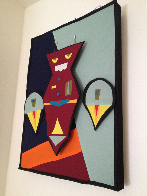
So, I’ve been toying with some new things lately, and Kyle and I have been invited to propose a kinetic sculpture for permanent display in a very specific space.  I love kinetic art – LOVE it, but the thing is, I’ve turned out to be a mostly 2d kind of girl.  My most sculptural work to date has been the dimensional wall hangings from the Friendly Neighborhood Robot Factory show.  Those consisted of robots projected off of a fabric background with some of them having several levels.  This photo of Roboscout illustrates that.  They’re sculptural, to a point.  Some of them were even kinetic in the widest sense – Boombot with his light-up equalizer bars, the Wrasselator with his moving arms, ect. roboscout The thing is, this proposal is going to have to be something that is more dimensional, more kinetic, and frankly more collaborative between Kyle and I than any other piece we’ve worked on together.  And let me tell you, I know jack about building a true kinetic work.  So what did I do?  I went to the library, that’s what I did.  It takes a while to get what you’re searching for, but once you find it there is a gold mine out there of helpful books.  My personal favorite was Creative Kinetics:  Making Mechanical Marvels in Wood by Rodney Frost.  It goes to the trouble to discuss all different kinds of moving works, terminology, and it discusses the way different pieces will move, which is especially helpful for someone like me.  I decided to start off slow by making a mobile in order to test out the motion and construction of a piece.  Due to the space we are making our proposal for, a mobile is not practical, but who says you can’t get your toes wet first before you get down to business?
14700965204_9e5d09a406_z

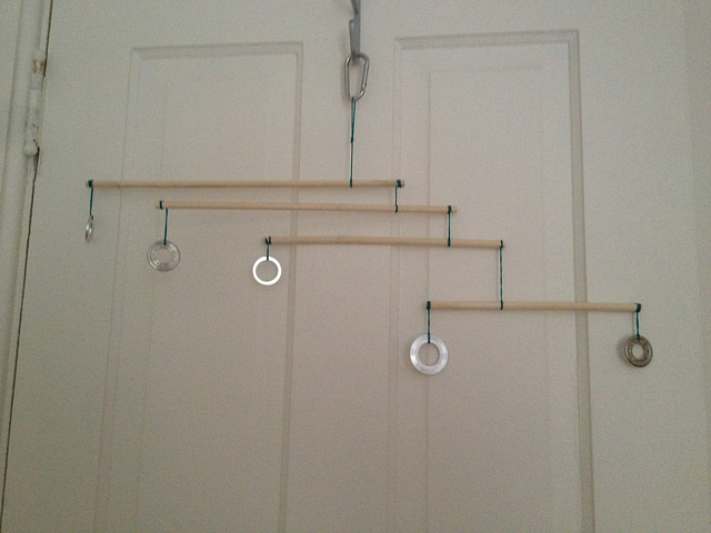
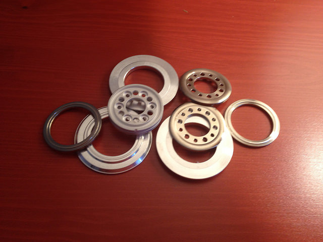
I had a nice rummage through my art hoard and came up with a pile of hard drive components that would look attractive in an arrangement.  I started by making a lever, a branch with one weighting item at each end, and finding it’s balance point.  Then I made the first vane.  A vane, think weather vane, is a kinetic piece that is designed to be weighted on one side.  Since I wanted to start with a simple but still elegant mobile design, I laid out my mobile to have one lever and four veins.  Each vein is counterbalanced by the weight of the rest of the mobile and/or the lever underneath.

14703076042_e6e95b634f_z

Let me tell you – the balance on these bad boys is hell of tricky.  Apologies for the awful photos!
Studio Space – Starting From Square One

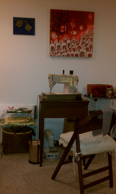
So, recently I took a couple of months away from art in order to pick up and move to a different state.  Part of that involved moving my studio into a different, much smaller space.  Those of you who know me know that I am the kind of an artist who hoards a fair amount of stuff, so you can appreciate the challenge I faced.  I mean honestly, where am I going to put my five sewing machines?  What will I do with the fabric?  And that says nothing about the jewelry supplies, paints, pots of glue, bottles of ink, boxes of interesting tidbits, etc., etc.

7315624030_d9ce5c73d9_z

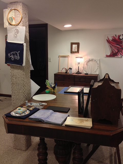
I have found that having studio space helps me to make time for art in my life.  That said, I have never before had an entire room devoted to being a studio.  It always seems like I’m cordoning off a corner of the living room in order to make something.  In the last iteration of a studio I had, I had a corner of my very large living space in my three-room apartment devoted to art, a large highboy dresser, storage in the furnace room, and a large closet as well.  Whenever I was working on a larger body of work, I would modify the rest of my space in order to make it work, so the dining table became a layout space, the corner by the fridge was where I propped up pieces to finish the edges and so on.  (If you are interested, here is a photo set of my work space changing over the years)

9243107287_8bd2c60ba7_z

Well, suddenly, I have a three bedroom house.  This means a studio.  This also means a purge, since I’m no longer using my entire home as work-space.  The never ending artist dilemma of what to purge!  I wound up cutting through a fair amount of my fabrics, a few projects, and some out-dated patterns that I will probably never use.  These were posted up online and sent out to some lucky Facebook fans.

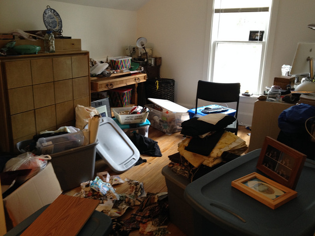
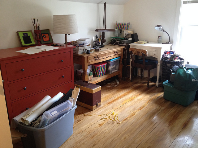
Then came the packing.  Endless, endless packing.  Followed by endless unpacking.  I told Kyle my plan was to make it half studio/half office in there so that he could work while I was designing jewelery or working on a piece of art, and his disbelief that we would both fit in that one room was palpable.  Looking back on the photos, I understand.

14287466875_8c276e91d4_z

Previously, I had a highboy dresser containing most of my fabric along with some supplies such as specialty papers, yarns, etc.  Unfortunately, that didn’t really work in the space I had.  Just about every piece of furniture needed to have a surface I could work on, considering that the dining room table was going to be on a different floor of the house.  And then Ikea to the rescue!  I’m still organizing drawers, and the closet is a bit more full than I’d like. (only three totes I don’t want in there, which is not so big of a challenge in the grand scheme of things, right?)

14264347726_a59ff74650_z

Honestly, I think the takeaway is USE WHAT YOU HAVE BEFORE BUYING MORE FABRIC/PAINT/WHATEVER.  Which is what I have been working on with projects like curtain making for the house.  Also, super fab bonus is basement storage for things like spraypaint, large pieces of wood and the like.

14285466122_f5a6bef58c_z

I have already been in there working, and I have to say it is IMMENSELY satisfying!


My Day at the Chicago Northside Mini Maker Faire

Mfaire

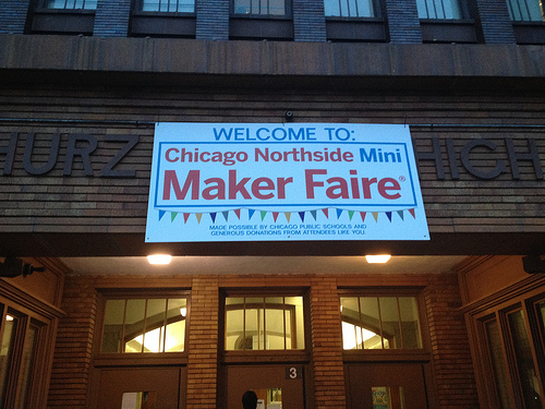
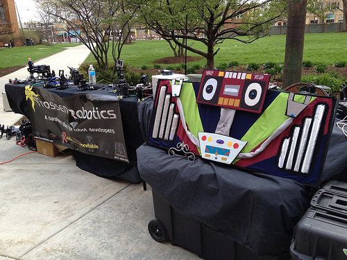
Saturday was the third annual Chicago Northside Mini Maker Faire at Carl Schurz High School in Chicago.  It was my first year in attendance, and my first time at a Maker Faire.  I did not have my own booth, rather I helped Kyle from Trossen Robotics man his booth.  I did bring a piece of art we collaborated on together for the Friendly Neighborhood Robot Factory show at Lala Gallery two years ago, though.  It has been about a year and a half since the last time I vended at an all-day event, much more than that since the last time I was vending at an outdoor event.  I am both better and worse at it than I recall being.  Word to the wise – you can never have too many bungee cords when vending outdoors.  Also, make sure to coordinate with your fellow vendees about signage and storage.

bothie

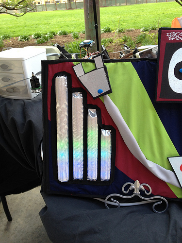
Surprisingly, to me, BoomBot became the star of the show for a little while when there was a group of people more interested in the less technical/advanced part of robotics.  I got to show off my fascinator from the Robot Show and talk soft circuitry with folks thanks to BoomBot’s sexy lights.

bbcloseup

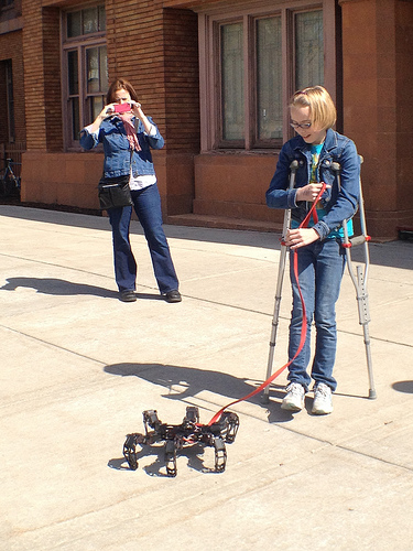
I spent a lot of my time demoing the Voodoo Arm Controller that Trossen sells for one of it’s robotic arms, and letting kids, students and parents alike walk the “pet” robot – a hexapod with a leash clipped to a joystick on it’s back.  I love being out and about with the hexapod, because there are only two reactions people have to it; 1.  OMG THAT IS THE COOLEST THINGS I HAVE EVER SEEN!!! or 2.  OMG A SPIDER KILL IT, KILL IT!  Both reactions are pretty great.

kidwalk

The location, Carl Schurz HS, and so there were a lot of great students helping out and attending.  It is also a gorgeous school, the pinnacle work of architect Dwight Perkins, done in the Prairie Style.  I spent some time photographing the building, and I made a set on Flickr of my shots.

cshurz

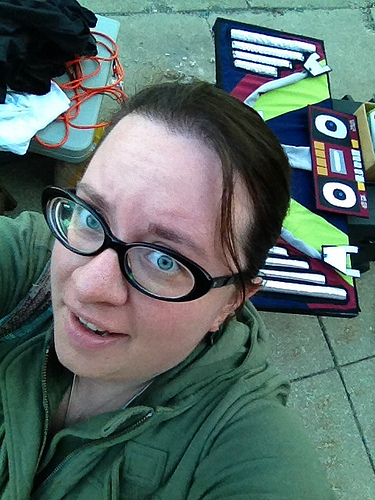
Overall, this outing was kind of a test run for potentially having my own booth at the Maker Faire next year.  I still need to do some homework, but I’m thinking I might jump in!  Since this blog seems to run towards insight into the work an artist does, I will say it is always, ALWAYS, a good idea to have attended the events you are going to participate in.  It only takes one time vending at a church holiday market show stuck between rows of Tupperware and Scentsy booths with no interest and no sales to learn that lesson.

selfie

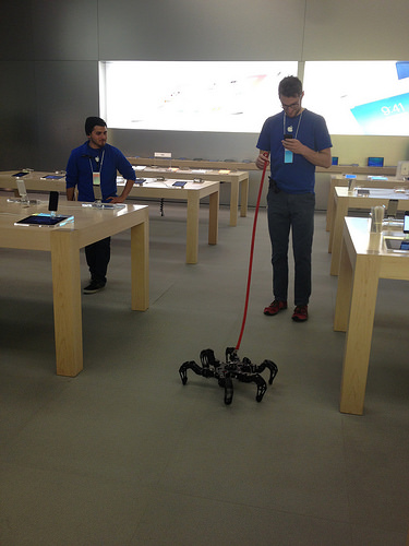
P.S.  Super sweet bonus since this post is so late in coming.  FYI – the Apple Store in Lincoln Park is both dog AND robot friendly.

AStore

One-off Work

As a working artist, I always strive to innovate and keep my work fresh.  In order to do this, I experiment a lot.  Sometimes the payoff is immediate, and sometimes it takes longer to show up in my work.  The less successful experiments I do tend to kick around my gallery for a long time.

I am currently working on the final stages of a major life change for me.  I moved to a different state earlier this month, and I am currently finishing up one of the hardest parts of that – setting up house.  As part of this move, I have been taking stock of the work I have that is kicking around my home.  Prototypes and experiments that have never seen the light of day before now.  It isn’t bad work, any of it, but it was a series of stepping stones more than a destination for me.

A lot of artists don’t want anyone to ever see any piece of their work that isn’t absolutely technically perfect.  In theory, I disagree with that because this construct can prevent artists from putting good work out.  If you want to be an artist it is okay to make work only for yourself, but if your goal is to become a working artist and no one knows you make art, doesn’t that kind of defeat the point?  However, in action I have many many pieces that are these stepping stones.  There is feeling and intention underneath of them, they just aren’t the destination I was heading for.

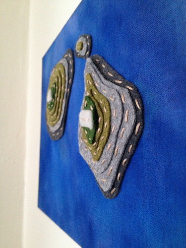
I often tell people that all art is important, and so with an eye towards that, and towards making room in my new studio, I have started listing some of these one-offs in my Etsy shop.  I started yesterday with a simple piece.  It is wool felt stitched in layers on top of a hand-dyed ocean of cotton.  It is a topographic depiction of an atoll that I did with an eye towards experimenting with adding dimension to a flat surface, creating texture on fabric with ink, and constructing things with solid felt.  Overall, I am very happy with it.  It led to some texture work I did in the background of a small series of mixed media pieces, and it improved my construction techniques for my felt art-jewelry.


D1

So tell me, do you have any experiments that are hiding in a back closet just because they were the stepping stone and not the destination?  Why don’t you take them out and show them to the world?!

Showing a Show

I recently attended the opening of my tenth gallery show.  I’ve spoken before about how much hard work goes into art, but that work isn’t over just because you have all the pieces done.  The display of your work is almost as important as the time and labor that went into making it.

There are a few things you have to think about while you are making work for a show that can save you a lot of headache.  The first one is how much work you need to produce in order to fill the space you are allotted.  The second is the size of your pieces in relation to the specific needs of the space.  I’m not saying that there is only one correct way to hang any specific body of work, but to show it off to the best advantage, it is a good idea to take the space into consideration.  For instance, are there two five-foot walls on either side of a door?  Perhaps you should make pieces of the same size to go on either side to make a pleasing visual harmony.

In my case, I also had to consider cord management since most of my pieces are powered by electricity.  Above is an image of one main wall of the gallery my work is currently hanging in.  You can see that the cords are wrapped neatly around the hanging system.  This was a workaround we came up with after seeing what the cords looked like when allowed to just do what they wanted.  Below is an image of a piece without the cord wrapped.  Visually, it is much more distracting.


Another really important thing to consider is lighting.  Most of my pieces are iluminated, and I didn’t want the gallery lighting to fight with that.  Because of this, the show was scheduled early in the year – to minimize the amount of light from the large windows in the gallery that would wash out the effect of my work.  We also pointed the track lighting in the gallery at the floor in front of the work.  This provided enough light to see the craftsmanship of each piece without inhibiting the effect of the lights on the overall visual integrity of each piece.  However, I did do four small art-jewelry pieces that required lighting.  We worked hard to attain a soft light that wouldn’t contrast harshly with the rest of the lighting in the room.


There is a lot more than that which goes into the install of a show, but I hope this gives you a taste of what kind of considerations need to be made when hanging a body of work.


Proudly powered by WordPress
Theme: Esquire by Matthew Buchanan.